HPL2/Tutorials/Level Design
Most of tutorials explain how to use the editors and the engine. However, they don't really explain how to avoid many pitfalls of making maps in HPL2. Hence, this tutorial will teach you how to make a proper map in Amnesia. For this tutorial you must at least know the basics of using the LevelEditor and have the modding tools installed.
Contents
Basics
In Amnesia, there are separate asset packs, named "-base", e.g. mansionbase. These shouldn't be mixed unless you absolutely know what you're doing; therefore, we will be picking one and sticking with it.
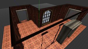
Since many beginner modders make mostly mansionbase maps, I will use it in my example. Let's start with making a basic room:
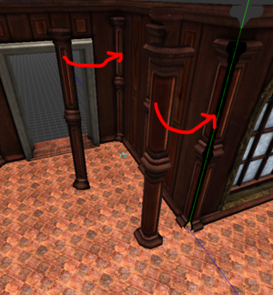
Remember to use both convex and concave welders in corners:
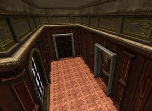
Don't forget that you can get creative vertically. Amnesia has dedicated assets for this, usually in the ceiling section:
I also added doors - remember that they should also match the asset base you're using.
Decorating the room
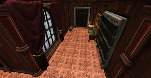
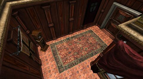
Now that we have a framework, we can start adding onto it. When adding furniture and other objects, always have the rooms purpose in mind; for example, my map is pretty much a corridor, so it doesn't make sense to be placing much furniture in it, and neither does putting anything which would block the way in the middle.
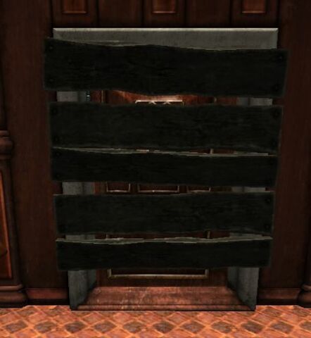
I put some planks on the door; It's not for gameplay reasons, but to give the player a feeling that the place is bigger than it really is. When making something out of repeating models, remember to do slight variations of the them; rotate and scale them slightly. Here, I also rotated some of the planks by 180 degrees to fake having more than one model on hand.
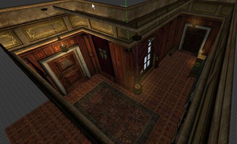
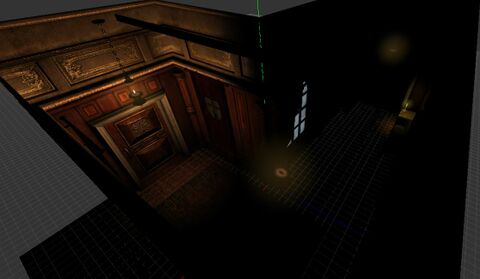
I also added some lamps, and turned some of them off, which is for the sake of making the level darker, and showing you how to do proper lighting - because one thing you need to now is that 'the lamp entities aren't enough to light your map! To see how the level will look in the game, turn off the ambient lights in the editor:
I hope you can see that this isn't the way to make the level dark; we will tackle this problem in the next section. Even a dark level needs some light, otherwise the player won't see anything, and believe me, it isn't what you want.
Lighting
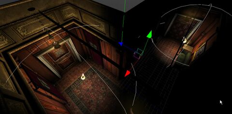
Let's start by adding some pointlights:
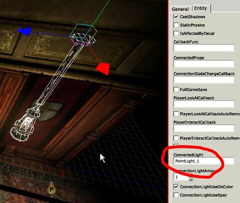
We can use a trick to make them synchronized with the nearby lamps; You need to put it's name into the lantern entity. Also make sure that the light's color is almost black (0.1, 0.1, 0.1), otherwise it will be very bright in the game.
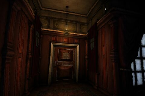
It doesn't change the light in the editor, but the effect in the game is pretty sweet. By the way: Always remember to adjust your gamma settings before testing the map in the game! This is the only way to know how the map will look for your players.
As you can see, the corners are unnaturally dark (in reality, light bounces off surfaces and spreads quite evenly around rooms). To battle this, we need to use a Boxlight. There are some rules to using them:
- Boxlights are for general light ambience of the level.
- Use only one BoxLight for the whole map (for the sake of unity).
- The boxlight should cover the whole map (going out of a boxlight looks very bad)
- The boxlight has to be quite dark.
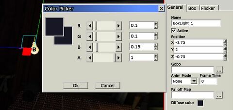
Having that in mind, I made the following:
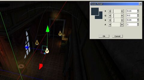
I made the BoxLight ever-so-slightly blue, because I will be adding moonlight in a moment.
Unfortunately, I can't show you how the boxlight affects the in-game look, because screenshots don't catch the gamma settings, and this subtle effect simply isn't visible in them. Keep in mind that it can still make a huge difference in the actual game!
Anyway; As I mentioned, we will take care of the moonlight now. I'll be making this similarly to how Frictional did it in the main game. I added a faint, blueish poitlight in front of the window:
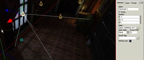
And a SpotLight of the same color, which needs to go inside the room. I also added a fitting Gobo, which is a texture map which simulates shadows - the shadows actually casted by the window aren't good at all.
I also noticed that the candle kind of interferes with the moonlight, so I'm turning off the candle for now.
And that about does it for the lighting in this scene!
Billboards
WIP
Particle systems
WIP
Decals
WIP
Other details
WIP
Closing statements
Obviously this map isn't the most interesting nor original, but it's decent enough to use in a Custom Story, and if you use the principles which I showed you in this tutorial, you might create something worthwhile! Thanks for reading!
~Darkfire WIP
